For this lab assignment, I spent a lot of time looking through the data and experimenting with the graphs. It was a bit challenging to find the right graphing tool for the portion of the data I chose. I looked at the count of the 10th popular name of each year, including male and female names. I included data from each year to see if there were any repeated names were the least popular from the top ten. I knew there would be repeated names in 10th place, but I assumed popular names varied as time passed. I used the stacked bar chart to visualize my data because I thought it showed what I wanted to emphasize the best. Stacking the data allows you to look how many times that name was the 10th most popular name. You can also see the total amount of people that were named that specific name when the name was the 10th most popular name.
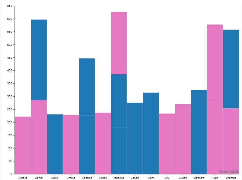
I changed one part of this graph. Originally, the box that represents each boy and girl from each year had different colors. So each name that was 10th most popular between 2001 and 2010 had a color representing the count of the name. There were ten different colors on the graph. When looking at the graph, it became difficult to understand. My focus wasn’t on the specific numbers, it was on looking for repetition within the data. So, I decided to change the color of the data. I grouped the data from 2001 to 2005 in blue and 2006-2010 in pink. This was so I could see the similarities and differences in the 10th most popular name over time.
During Lin’s lecture, Lin made a lot of good statements. One idea that stood out to me was to make sure to understand the data. I spent a lot of time grouping and experimenting with the data because there was a lot. It was also confusing at first when putting it into the pivot table. But taking the time to understand what you are looking at helps you understand what you are seeing. The second was to make sure to use the right visualization tool. I am still not sure if I used the right visualization tool; I spent a lot of time looking through the various tools, and this one gave me the best result.

I also found that experimentation with different visualization tools is important because it allows the data to be seen in different ways. Although as you said it can sometimes be difficult to find the best one. I believe simplifying your colors made the graph easier to read and I find it interesting you chose to look at the count of the 10th popular name of each year.
I like how you took specific information out of all the data to look at. It provided a more interesting and easier to understand graph. I am surprised to see how many names were repeated through out the time window. I would’ve expected to see most of the repeat years in the same color.