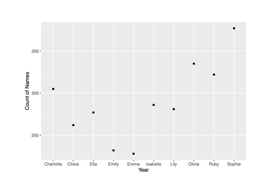
I chose to display the Count by Gender = F, for the year 2010. I chose to display my data using a scatterplot because it serves as an appropriate display of data for the individual name counts for one specific year. I did not have a driving research question, but I ultimately wanted to display the most current data of Name Counts for Females. My visualization may help DH by displaying the importance in zooming into a group in a study and their most current behaviors. In a wider and more intricate study I would track all the Female names for every year by matching non-unique names in order to observe any pattern behaviors within reoccurring names.

It’s interesting that you singled out the most recent data as the most important to graph. I just took all the data without think as some being more relevant than others but it’s true that the more recent the data, the more potentially relevant it can be to researchers. It should be highlighted as such!