The project I choose to explore was about “The Forced Migration of Enslaved People In The US.” In this project, you can see the forced migration of enslaved people between the years 1810 and 1860. The main focus is on states in the south/southeast. I am assuming this is because the slave trade had it’s prominent impacts during this period.
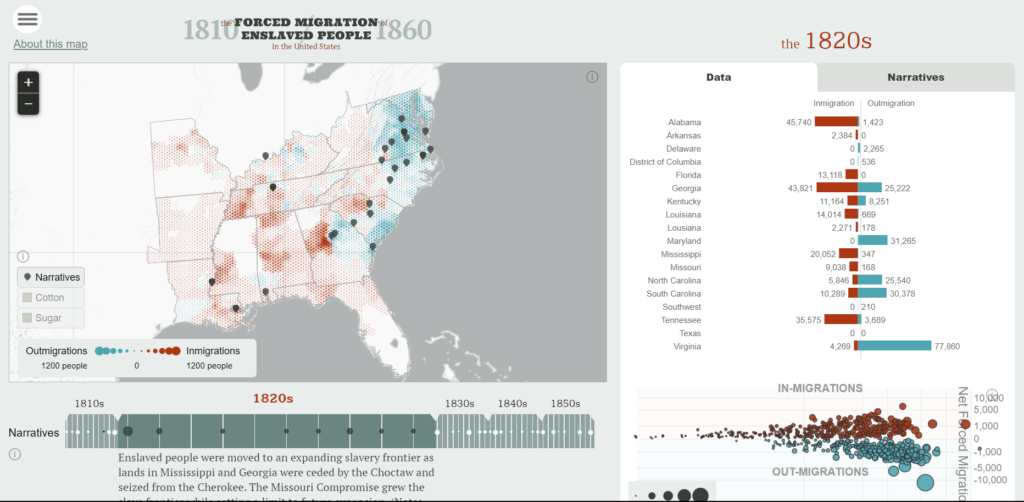
This image shows the different data about the population of different southern states in the 1820’s. The project presents its data through an interactive map, a bar graph and a bubble plot
Sources: The information I found about the data was very interesting. Because of the period, the birth of new Black enslaved people was not recorded so, some of the numbers and locations were estimated. Frederick Bancroft was the one who estimated the data I mentioned before. When coming calculating the data, he assumed that the growth rate of enslaved children was uniform through the years and in each state. The data from the in and out migration was also an estimate that they calculated. The other data, such as information about cotton and sugar came from National Historical GIS. The information about state boundaries for the interactive map came from Newberry Library’s Atlas of Historical County Boundaries.
Process: The project is organized into 3 main parts. An introduction, an about page that provides information about how to use the map, and the interactive page. Focusing on the map, many components explore various data. There is an interactive map that is used to analyze the total population in counties and estimate the amount of outmigration. There is also an interactive timeline that provides context to the current period and the movements occurring. Within this map, you can also read personal narratives from those directly affected. The data on immigration and outmigration is also organized in a bar graph and a bubble plot. These representations allow the viewers to understand and analyze the data in different ways. Those who look at the bar graph or bubble plot can see the similarities/differences in population. Those who view the interactive map can view the expansion of the population within the community.
Presentation: The presentation of this project had many different components. When you click on the link, you are led to the title page that gives you the name of the project and historical information about the topic. Moving onto the next slide, the presenter provides information about how to navigate the maps and explains what is shown. Throughout the first two slides, the color scheme is the same, including colors like turquoise, red, white, blue, and black. Moving on to the next slide there are different components. The color scheme is the same but there are multiple ways the data is presented. All the ways that you can analyze the data are shown on one screen which is efficient when wanting to find information easily.
Questions: One of the main questions I have is why Virginia has such a high outmigration rate each year but the population is rising steadily. There could be a part of this data that I do not understand but this is one part of the project that stood out to me. I am also very curious about how they were able to estimate some of the information and how accurate it would be if the births were recorded in the census. I also wonder how this data would be different if they had access to the information they are missing.
Which academic fields (i.e history) do you see the project in conversation with?
- This project is in conversation with History, Education, and Statistics/Math. The information presented has to do with the history of the United States. It is also something that relates to education and the education curriculum because some of the findings are really important and give insight of our history. I also included Statistics/Math because some of the work was done to estimate some of the data.
What is the goal of the project?
- I think that the goal of this project is to to inform others about the forced migration enslaved people had to go through in the South. When it comes to the data, I think they wanted to emphasize how unfair it was to enslaved people because even though they weren’t human, they didn’t have the right to be considered in the census. They wanted to emphasize or even get the views to think about the impact this constant shifting in enslaved people had to experience. I also think it was to give insight into the general population growth/decline in different areas and how different states slowly reached the population they are today.

This project looks really interesting. I’m really interested in how immigrations and outmigrations are differentiated by color and it’s more population gain vs population loss. It puts into perspective for me how much record keeping people of the past have done.
This project seems to incorporate the interdisciplinary aspect of digital humanities well, as it includes both data and narrative tabs. The audience can look at both the numbers and people involved in the presented topic, which is really important, especially with topics like these. It’s also really interesting to me that some of the data is estimated; I wonder what their estimation method was and how they ensured accurate final results with estimated data.