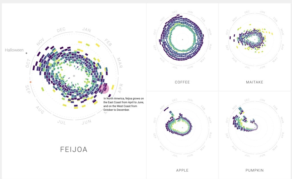
The Rhythm of Food project really caught my attention when I was scanning a few of the DH projects, and after checking it out, I have to admit that it’s a very engaging digital project. This research examines Google search patterns for numerous foods in the US from 2004 to 2018, going in-depth with each trend. This project stands out in particular for the insights it offers as well as the manner in which they are presented. The Rhythm of Food project’s center is Google Trends data. The project’s developers collected weekly Google Trends ratings for 15 years in order to produce this digital masterpiece. As a result they made a thorough dataset that provides a clear picture of how our preferences for certain foods have changed over time. But this project’s presentation is what makes it unique. The Rhythm of Food uses a visually appealing approach rather than drowning users in a sea of data. It uses circular graphs, which they refer to as “year clocks,” to show the ebb and flow of interest in different food items within a given year. In addition to making the data easier to understand, this visual storytelling gives the project a creative touch. Now, this project’s dedication to open access and open source principles makes it much more impressive. Since Google Trends is the source of all the data used in the project, anyone who wants to investigate it can do so. One thing became clear as I got farther into the project: food trends are more than simply statistics on a screen. They tell a story about changes in society, seasonal tastes, and even the influence of holidays. Consider chocolate as an example. There are obvious peaks in November, December, and February when you look at its year clock. These spikes correspond with Christmas, Thanksgiving, and Valentine’s Day, displaying our shared love of chocolate throughout these holidays. All in all, I was wondering how challenging it is to use and how I might use visualizations similar to those shown in this project.
