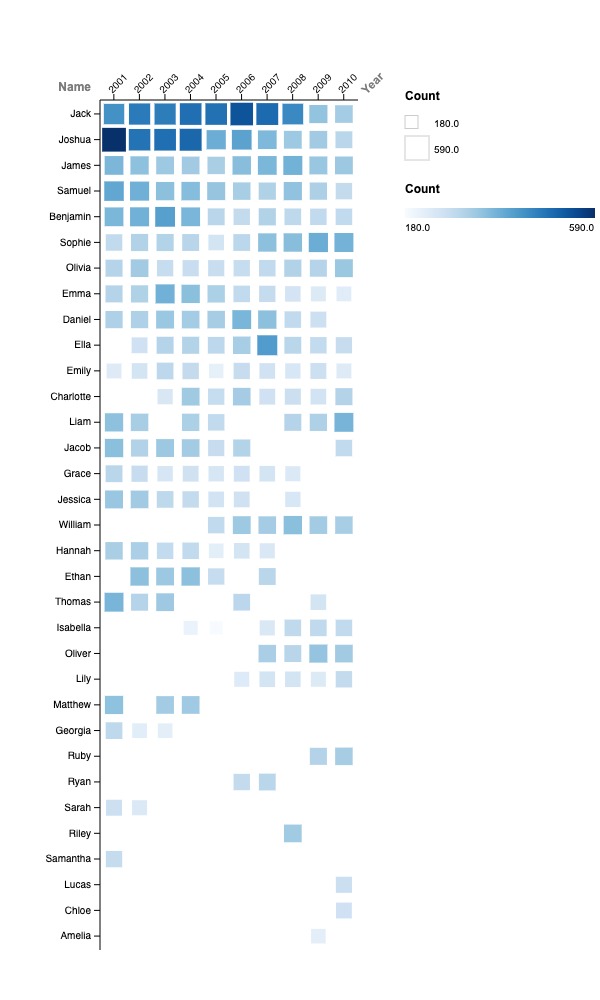
I used a matrix plot on Rawgraphs to visualize the given data. There were lots of different types of graphs to choose from, so I decided to try them all out. I ended up choosing to make a matrix plot because of its simplistic but effective visuals. The size and color of each square shows a good estimate of which names are popular every year. To make the popular names stand out, I changed the y-axis to “Total value (descending)”. This arranged names in descending order of popularity, with the most popular at the top and the least popular at the bottom. I also made sure to add a legend for easier understanding of actual values. While this matrix plot may not provide precise numerical data, it effectively facilitates comparisons based on size and color.
Reflecting back on Lin’s lecture, I learned that Visualizing the data we gather and learn is crucial in digital humanities. However, selecting the appropriate visualization method for each dataset is always crucial. Before the lecture, I wasn’t aware of the diverse range of options available for representing data. My previous experience with graphs was limited to those commonly used in math classes, such as line graphs, pie charts, and scatter plots. A lot of data can be lost if not specific enough or very messy graphs can lead to confusion. Through her lecture and this exercise, I realized how difficult it really is to integrate aesthetics and clarity into a graph. But thinking ahead, being flexible, and working around any possible problems can help make the visualization process easier. While there are other ways to visualize this data, I believe this matrix plot does a satisfactory job, and that’s what I find valuable in the field of digital humanities. It encourages us to view data from various perspectives.

Thinking back on Lin’s talk, I figured out that showing data visually in digital humanities is super important. Picking the right way to show each set of info is vital. Before, I didn’t know there were so many graph-making options. Messy graphs can make things confusing, so making a graph that looks good and makes sense is tough. But looking ahead, being flexible, and solving problems can make it easier. Your matrix plot is excellent because it lets us see data differently.
I think it’s really cool that you chose to use a matrix plot to visualize the data. I believe your graph’s opacity changes and box size adjustments enhance readability and make it very visually appealing. Through Lin’s lecture, I also learned how difficult it can be to balance both aesthetics and clarity in a graph. With time and more understanding of what digital humanists use different graphs for it might be easier for me to know the best way to visualize the data I am presented.
I really like how you used color in your graph. It emphasizes certain details in the data that wouldn’t otherwise be clear. For example I did not realize how popular Joshua was in 2001. I also chose to use a matrix plot but I didn’t think to use shading this way. It would have made my graph a lot more effective.