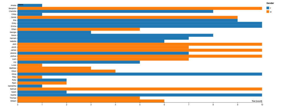
I chose to visualize the data of 10MostPopularBabyNamesNZ_2001-2010 using a horizontal bar graph. I found the simplicity of a bar graph practical and easiest to read and make for the set of data that was given to me. When moving around the given categories I ultimately decided to leave out the ranking category and use the year (The year can be seen as 1 – 10 because the data only contains the years 2000 – 2010 so I used the last numbers of the years to define the x-axis but, the problem with this is that it doesn’t show the person reading this the actual year when reading this and due to the limitation of the data I did what best fit my view of the graph) and name category to make this graph but, you can also interpret the numbers on the x-axis as the year and ranking although the ranking won’t be accurately shown due to the limitation of the graph. The color coding for both genders was the automatic colors selected by the website used to make this graph (Rawgraphs.io) additionally I also had to make it a horizontal graph to make the numbers and names legible. What I found interesting from this graph is that most of the popular male names start with the letter ‘J’ and the most popular female names start with ‘E’, ‘G’, and ‘H’.
Digital Humanities and Lin’s lecture
When listening to Lin’s lecture she mentioned the integration of analytical data with art to produce an aesthetic visualization for people to view data. Humanities are always improving and always finding new ways to turn data into something new; now with the technological improvements Humanities have moved onto the digital sides of the spectrum. This opens up different interpretations ranging from simple data like this one or complex data that can bring ideas into representation digitally or physically. When someone looks at how I viewed this data I presume that different visual representations can stem from here or from other views that are similar to my view of this data

Lin’s talk about mixing numbers and art caught my interest. It’s remarkable how technology helps humanities go digital. Thinking about turning data into pictures or even physical things is exciting. Your way of looking at data makes me think there could be different pictures or ideas. It’s like a giant canvas where everyone can bring their unique views to life.
I’m glad that you specified and added labels for the x-axis. At first glance, I thought the x-axis were the ranks but I looked closely and saw the label for years. My matrix plot also had limitations such as the exact number of names and I couldn’t include ranks. But, the simplistic and effective graph does its job for visualizing the data. I also agree that there will be many more advancements to how we can visualize data in digital humanities. Thanks for sharing!