I chose to place the data into a violin shaped graph. I sorted by year on the y axis and names on the x axis. The two different colors are the two gender variables provided (after the required reading, the argument about heteronormative data rings true in the binary gender options). I changed the margins a lot to make the graph more legible. I needed to push the x axis out a lot to be able to read all the names. I liked the way this graph used visual bubbles to denote the popularity of a name over the years. It doesn’t prioritize exact counts of names but rather shows the relationship between the popularity of certain names, clearly and distinctly. I ordered the graph from lowest frequency to highest frequency.
Two issues I ran into were the way that years are written, with a comma, as if it were a numerical value (could not figure out how to fix this) and that sometimes the violin shapes would cover the names, crossing the x axis. I just don’t believe this program can handle these issues but perhaps with a more sophisticated graph designer I could edit these small annoyances.
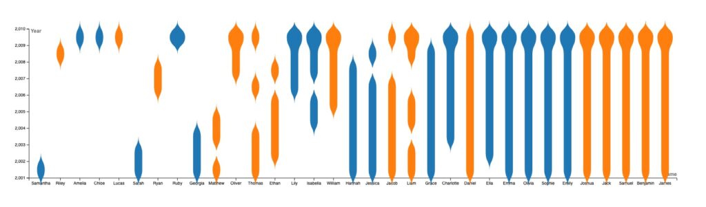
Our class discussion with Lin has made clear to me that understanding how to visualize data is essential to the digital humanities. Bridging the gap between art and data is complicated and there will always be critics on either side. Finding a way to integrate aesthetics and clarity into a graph is really difficult and impressive. The digital humanities are all about trying to look at the humanities through a digital lens so, although this data set is pretty straightforward, finding new ways to display it and opening up new interpretations is the aim. I hope when someone looks at my graph they can appreciate the beauty of the violin-like shapes but also the interesting trend that the names Emma, Olivia, Sophie, Emily, Joshua, Jack, Samuel, Benjamin, and James all have the exact same frequency over the years. Just looking at the raw date would not easily reveal this fact.

The way you described your graph was very well down. Your language choices paint a clear and succinct picture of what the violin graph is presenting to the examiner. I also could not figure out how to remove the comma from the year labels which was unfortunate because when someone views 2010, they automatically think of the year. This does not happen when someone is presented with 2,010. The mind goes straight to the number. I agree with you as well on what you got out of Lin’s presentation.
This graph looks really cool. I had never seen a violin graph before so it’s pretty cool to look at. I agree with you, finding a way to make graphs look pretty to look at while also presenting all the information you want to present is really hard especially if you’re not used to making graphs.
I absolutely love this rendition of the data, a very engaging and comprehensive breakdown of the set. I also ran into the same problem of legibility, turns out fitting many names into one space is a little bit tough. Furthermore, the in which you explain your stance on the relationship between graphing datasets and Digital Humanities is very perceptive.