This matrix plot shows the most popular baby names from 2001-2010 in New Zealand.
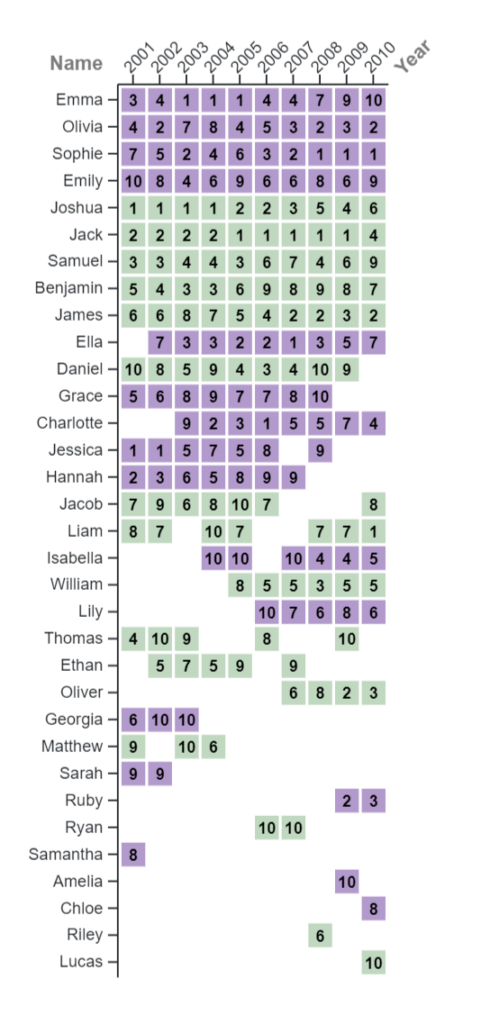
This specific style of graph is a good choice to represent this data because it clearly shows what the name is and what it ranked on any given year from 2001-2010. The graph also shows gaps where a particular name didn’t make the top 10. In this format, it also lets you see how many consecutive years the name was in the top 10. You can also see patterns in how long each name stayed in a specific rank or if they fluctuated a lot ( for example: Jack was 1st for 5 years in a row). Ultimately, the graph shows a lot of information in a clean and clear way.
I chose this type of graph instead of something like a line graph because the line graph was too cluttered and you couldn’t tell which line belonged to what name. This chart makes keeping track much easier. I also chose to separate the male and female names with the colors as this makes it easier to visualize.
To improve the clarity of the visualization, I changed the original colors to a softer color palate that’s easy on the eyes and allows us to clearly read the rank in the box. I chose not to add the grid lines to keep it from getting too cluttered, as I was keeping in mind a part of Liz Winton’s presentation and wanted to reduce “chart junk”. I also messed with the margins to make sure all the names weren’t cut off. Another thing I did was sort the y axis from biggest to smallest. This way you can see which names were on the top 10 the most (Ex: Emma 10 yrs consecutively, Lucas only once in 2010). This is a good way to use visual hierarchy by guiding the viewers towards the names at the top (the ones that ranked in the top 10 all 10 years).
Something that surprised me was that there were more names than I thought that were popular throughout the decade.
Looking back to Liz Winton’s presentation I really got to understand how representing data correctly means representing a story. While going through the process of creating the graph I was able to see more patterns in the data then when the data was in a spreadsheet. Winton’s presentation also reminded me of the importance of how my graphical choices can affect the way readers interpret the story. So I made sure to make thoughtful visual choices that help the reader make comparisons and highlight the important pieces of information. Going forward I will be keeping Winton’s lecture in mind, not just when I make my own visualizations but also when reading others.

I really liked your representation and color pallet. Although it is a very tall graph. I love that you sorted from the most appearances on the board to the least amount of appearances, and I think removing the gridlines were the right call because the boxes themselves make their own grid lines in a way. It’s a really nice and pretty graph.
I think this a really creative way to present the data! One major advantage of the matrix style is the numerical clarity of each datapoint–there’s no need to try to follow along or estimate a given point’s value because it’s right there on the box. This is a great way to represent the rankings specifically, as the numbers are always between 1 and 10 and their meaning is immediately clear.
I think your visualization is unique compared to others and easily tells the reader what is going. While a graph may be cluttered and hard to read because there are so many names, this chart easily tells me the ranking of each name over the years. The color difference with men and women also helps the visualization a lot.
This is a really effective way of displaying the name rankings for each respective year and name. I bet the line graph was very sauturated with random lines, especially filled with lines that started at random points. What makes this graph so understandable, effective, is the clear display of ranks with color coding. My only advice, even though it was mentioned in your comments, maybe a legend with what the color means and what the numbers represent would amplify the readability of this graph.