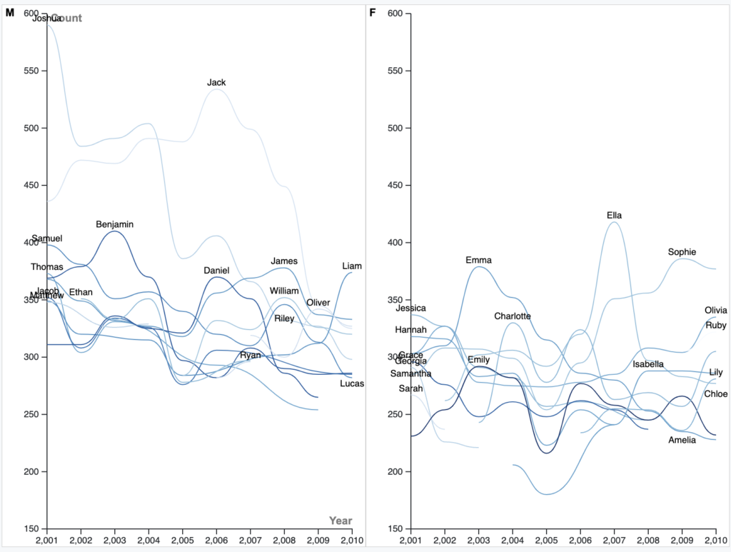
I chose to visualize the names themselves and their popularity from 2011-2010 with a line graph. I felt a line graph represented the data the best because of the easy-to-follow aspect of the lines. You can see when names peaked in popularity and when they declined. You can also see what year names started to appear on the top ten list in New Zealand or whether they were on the list the entire span of 2001-2010. A line graph felt most appropriate to use because of its ability to show multiple strands of data.
When I originally put all of the data from the dataset into a line graph, the graph produced was extremely messy and not at all easy to understand. I decided it was in everyone’s best interest to separate the male names an the female names into two separate graphs to make both easier to understand. It was the sensical thing to do, also, seeing how the male names and the female names are really two separate sets of data.
Reflecting on Lin’s lecture, I was very impressed. Lin seems extremely knowledgeable on all things data and I learned a lot. I hadn’t known what the Quantitive Resource Center really did before her presentation, but now I know I can go there for help with data if I ever need it. Lin’s exercises with graphs that were bad and needed to be fixed were very eye-opening as well. I had never thought about fixing other people’s graphs before.
The visualization I created relates to digital humanities because names are inherently a humanist concept. If the humanities are the fields of studies of humanity, then names relate to that. The graphs I created show the change in popularity of names of humans in New Zealand over a short time span, and this is undoubtedly humanistic in nature.

I think a line graph is a smart way to visualize this data. Something that stands out to me in this visualization that I have not seen in other ones is how some names experience peaks and troughs at the same time, such as some boys’ names in 2002, 2003, and 2005, and some girls’ names in 2005. I wonder what causes these coordinated movements? Is it media and other societal influences, or maybe just coincidence? Anyways, good post!
The way you interpreted the data is absolutely amazing. The usage of the line graph is a great way to represent the data of all the names and all of the different rankings. Lin’s lecture was very detailed in explaining the smaller details of data visualization that I didn’t even know about and I like how you use that to ultimately make a line graph to represent this data. Great work!