I chose to ignore the years column of our data so as not to clutter the visualization. Instead, I combined the counts of each name from all years to see the most popular names within the 10 year span. A bar chart makes the most sense for this because, as Lin said, humans are quite good at estimating and comparing lengths. We learned from her that a line chart would imply greater continuity than actually exists in our data, and area-based visualizations can be quite misleading quantitatively. With the bar graph, even just glancing at the graph shows which names are most popular as well as roughly how much more popular than the others they are. I did have to change the graph orientation to horizontal so the labels would be legible though, and I decided to have the most popular names at the top because that’s where people start reading from. I also incorporated the data that separated the names by gender, and I assigned them to the traditional pink/blue girl/boy divide. This again helps readers immediately understand the rhetorical meaning behind each color without overcrowding the rest of the data visualization.
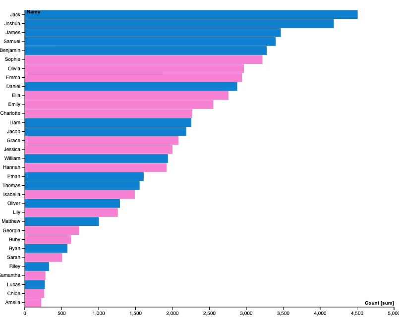
This is a pretty clearly relevant to Catherine D’Ignazio and Lauren Klein’s “What Gets Counted Counts” because it suffers from the gender binary. They criticize data and data visualization that over-categorizes and as a result upholds problematic divides in our society. In this case, it’s a problem inherent to the data which simply has its names divided into the M/F bins. Maybe a more inclusive visualization would omit the “gender” column altogether. Yes, it would technically display less data, but our goal as Digital Humanists is not to cram as much data into a graph as we can–it’s to tell a compelling and accurate story.

I definitely agree with your relation to the reading of “What Gets Counted Counts.” In my own graph I changed the label to gender to sexes because I believe it represented what the data was actually presenting. I also like that you chose to do a horizontal bar chart rather than a vertical bar chart. I believe it definitely helps with the readability of the names.
This does a great job at highlighting the overall popularity of names, and the pink/blue colour palette is a great touch! That gender binary does exist in a way mentioned by “What Gets Counted Counts”, but the underlying data we were given carried that binary as well- an interpretation of the information given makes sense to carry that across, even if in the larger sense it doesn’t make sense.