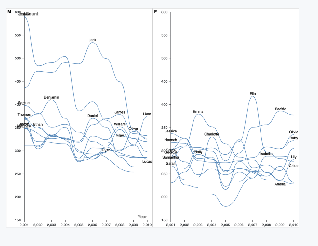
I chose to split my data into 2 different line graphs. Line graphs are essentially necessary since we’re track different items’ variability over time, specifically baby name popularity over time. Splitting the chart into 2 separate graphs (split by gender) was done so that clutter was fairly minimized. Obviously there’s still a major color problem. I think I could’ve made each line an indiviual color but explaining that with a ledger would almost be equally as annoying. What makes this data hard to chart is that if a name wasn’t Top 10 over one of the years, it didn’t make the list but that doesn’t mean no one was naming their kids Lily before 2004. Im still figuring out how the different graphing softwares work to be fair (and I’ve never used Excel before and thus was very confused as it felt very unintuitive).
Obviously, as mentioned before, this could be a lot cleaner and I wish I knew how to get into the nitty gritty more than what I did when making these 2 graphs. This does give me insight in the fact that making data visualizations necessitates keeping track of a lot of stuff at once, or at least maybe it just felt like that to me.
