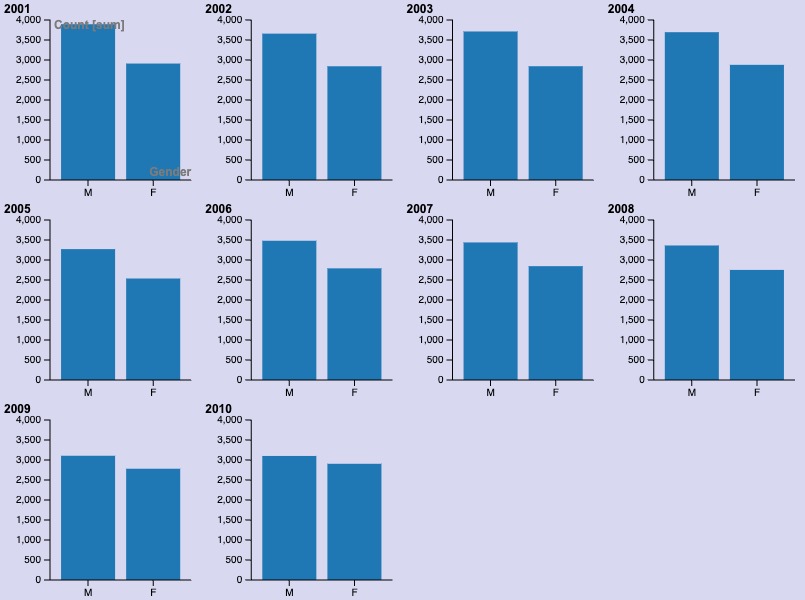
The graph I made, in the screenshot attached, visualizes how, in New Zealand, from 2001-2010, there were a higher number of males born with top 10 names compared to females. The graph shows that there is significantly less variation in name with males, hence the higher count. The ratio of men to women in New Zealand is approximately even, so that is not a factor. From this visualization, I also noticed that over the years, the gap has become smaller. We can see in 2010 that the gap is at its lowest. While the number of females has mostly stayed the same, the number of males has decreased, so we can assume that there is more variation in names. I changed the background color to supplement the color of the bar graphs well. Additionally, I created a different bar chart for each year so we can better understand the trends over time and for each year. We get the same final idea with a singular bar chart of all the years, but we can conclude nothing about the individual years. My graphic relates to digital humanities because it visualizes data and tells a story. In her lecture, Lin talked a lot about how we can learn so much with data as long as it is visualized appropriately and meaningfully. Lin showed us graphs that were improperly formatted, confusing to readers, and hard to see. I used Lin’s advice and believe I have a visualization that is in an appropriate chart and easy to read and understand to others. It relates to digital humanities because there is so much data and information in the humanities that we can learn so much from. We just have to be able to format the data in the right way to get what we are trying to convey to the reader.

I believe your visualization is quite nice, also I liked how you explained the actual source of the data; that seems to be something that I forgot to mention and would definitely go back to fix if I need to. However, it seems that there was a key component to the data which was left out, there is no way to determine which names are which, but overall a very nice graph.
I love the way you visualized this data. However, one major factor missing was the names which was a crucial part of the data set, your elaborate even with limiting the different parts of the visualization and explaining the variations of what the data set holds really caught my attention. Great work!