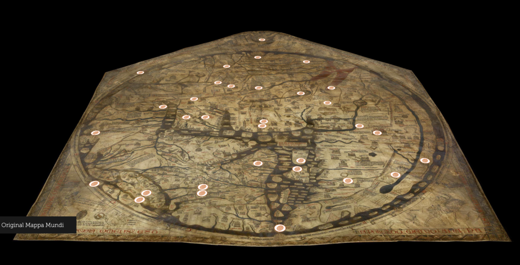
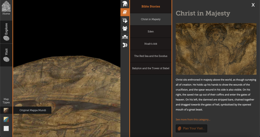
The Mappa Mundi was the representation of the world during the Medieval Times through the perspective of European Christians. The map includes parts of Europe, Asia, Africa, and the Middle East (The Central part of the map) why the Middle East is placed in the center is a representation of the start of Christianity which, can be seen through the passages in the Bible. There are also references to biblical creatures, stories, and major political figures in the Mappa Mundi
From my understanding in order for the researchers to publish this interactive version of the Mappa Mundi they would first need to scan the original version of the Mappa Mundi not just to have it on a website but also to preserve the information that can be understood and shared to the public. They also have a more legible version of the map in which you can see more of the color and the material that was used in making the original Mappa Mundi. This website also offers other resources dating back to pieces of ‘literature’ and other famous known pieces of history.
As someone interested in history but not leaning toward it as a major, I find this website particularly interesting as my curiosity will always bring me to pieces of history that influenced the way we do things now; and with it being digitized, it is more accessible which leads to more people being able to learn and interact with artifacts of history.
In this class, I want to understand how people continue to find new ways to make information accessible to everyone. Accessible information, new and old, is important for everyone to learn about because it can help influence future decisions.

This seems like a cool project that you looked at. I wonder what you think this project would contribute to the future. Was it more engaging than looking at a map? Do you think that other maps would benefit from being digitalized with points of importance on them? Some museums already have touchscreen maps that function like this website. Do you think it being a website online rather than on a screen in a museum contributes anything to it other than accessibility?
I definitely agree that having it online is mainly for accessibility and more of an incentive to come to the actual museums but, nevertheless I think that both ways of viewing the map can benefit the person viewing it regardless of location.
This is a topic I’ve always been curious about and it looks super cool. Medieval European civilizations seemingly had such a hard time understanding geography, both in the fact they had not seen parts of the world and were very confident in their guesswork. Plus, they couldn’t check by seeing the world from space since they didnt have the technology. I feel like a lot of old maps look ridiculous to a modern person but they really did shape how other people saw the world.