Project Introduction
The Rhythm of Food is a collaborative project between Google News Lab and Truth & Beauty that uses google search trends over the last 15 years to show patterns in people’s interests in certain food through the season/month/year in the US.
Sources (raw research materials)
The data that they use to design this website is gathered from a few different sources to build a dataset on food trends in the US. They helped gather 130,000+ data points on over 200 topics.
- They used a website called FooDB as a starting point to help analyze a bunch of different food items in one place.
- Google Trends data from 2004-2018 was used to see what years/seasons certain foods were most searched on Google. Google Knowledge Graphs, helped make sure the items they were focusing on were actually food (apple vs Apple (the company)).
Q1: Both of these data sources are available for broader use. FooDB is offered freely for noncommercial public use, and anyone can use Google Trends.
Processes (analysis, digitization)
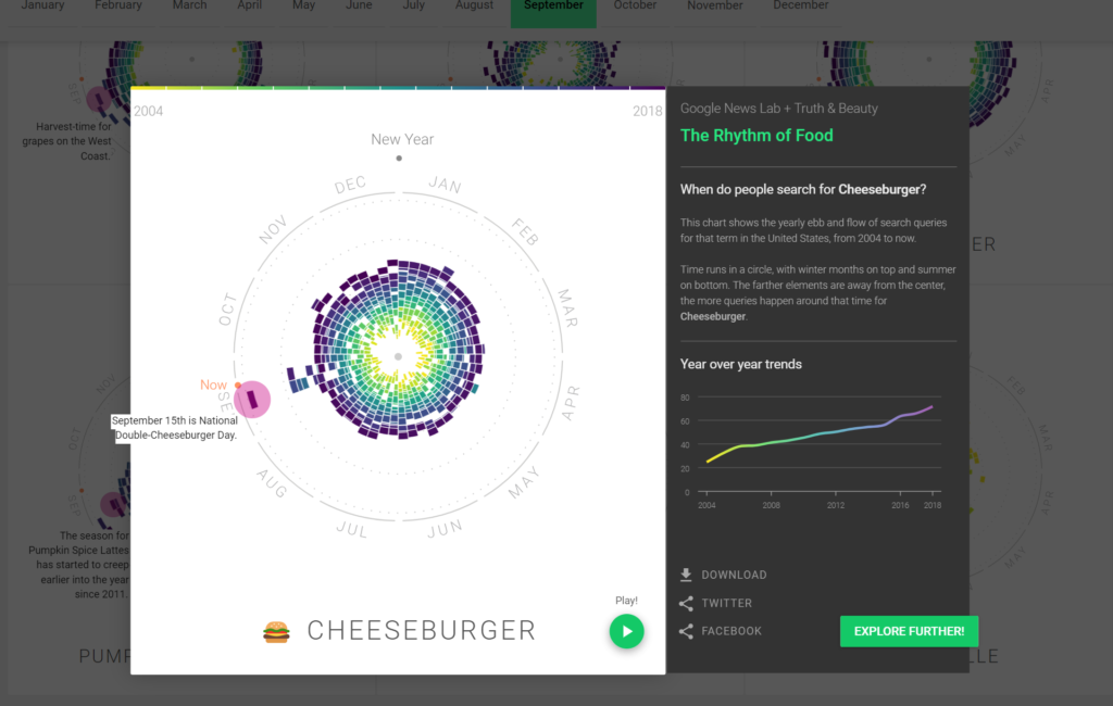
They started building the project with line charts but then developed their own type of chart, a radial year clock where the center shows search interest (1-100) and each color indicates the year. They also created animations for the chart of each food as well as pink annotation dots to add context to random peaks in interest. For example, strawberries have a small peak in February because many people get chocolate covered strawberries for Valentine’s day.
They used a variety of tools to build the site including ES2015, webpack, react, Material UI, viridis, and d3 v4.
Presentation (display, use)
Ultimately, the way this data is presented is through interactive charts (data visualization) and a different version of a timeline and some text analysis. They have a nice short animation to show viewers how to interpret the charts and the layout of the page is clean, making the user interface more friendly. You can filter the charts you see by type of food, the season they’re popular in, and special categories (like holidays or annotations). Each chart allows you to see if foods are consistent in popularity over a 15 year period and whether or not / when they are becoming less or more popular .
Q2: The target audience is anyone that is trying to sell food. They would probably use this project as a way of knowing when certain items are most popular in order to know when selling those foods would bring in the most profit.
New Question
A new question I have from breaking down this project is why they limited the data to only include the US and American holidays. It would be interesting to see how some of these charts would change in different countries and be able to compare them.

I chose to look at the rhythm of food also, and I agree with you that the user experience is very friendly and clean. I didn’t think of that question, but it is important that you bring that up. For example, with the screenshot you provided, the google searches of cheeseburgers in the US would differ greatly with the data from Mexico. Maybe in the future someone will develop a rhythm of food visualization with world-wide data.