After discussing how to break down the process of Digital Humanities projects in class, exploring “The Rhythm of Food” in greater depth appeared to be the most interesting. This website project intended to visualize the patterns of Google search queries, namely those pertaining to food(s) since it had been assumed that this topic would hold the richest dataset. Yet before gathering any sort of data, the seven creators of this project from Google News Lab and Truth & Beauty first had to decide what exactly to look for, i.e., what words mean which food, etc. By using FooDB, keywords were found in order to ignite the search for true data points, and to further the precision of the word choice, Google Knowledge Graph topics were used to distinguish between things like apples and Apple. Through knowing what exactly should be looked into, the main source of data information was extracted from a twelve-year span of weekly Google searches, gathered via Google Trends data. With concrete sets of data, the creators originally represented the data in simple line charts, however, they decided that the data needed to be displayed in a more visually appealing way.
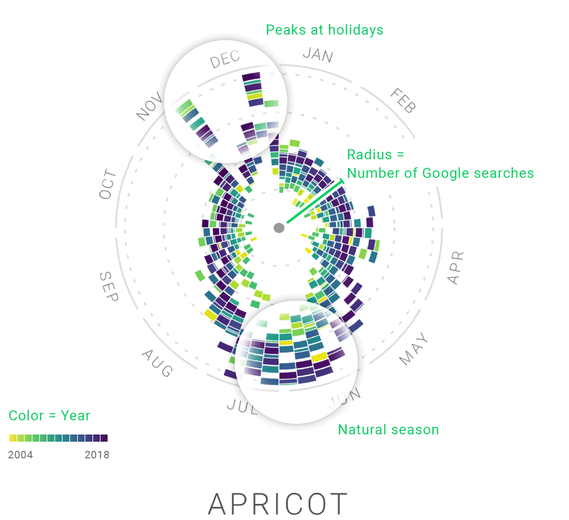
Ultimately, they developed what is called a, “type of radial ‘year clock’ chart to reveal the seasonal trends for food items”, and furthered the appeal by making them interactive and animated, small anecdotes throughout the website were added as well. By utilizing these types of charts, the creators are able to easily represent the data they found as well as portray it in a way that is eye-catchingly comprehensive. After breaking down and looking in depth into this project, most questions and inquiries about the construction and synthesis of the website and its data were answered throughout the process. However, after some reflection, I do wonder how this data can be applied in real life situations, as in, further than just looking into the trends under more motivation than simply since it seems interesting, as what the creators’ reasoning is.

I think the database you found used is interesting, FooDB being a collection of food, and descriptions is cool. I do however find the food chosen lacking. They were missing foods like kebab, rice, and tuna. I wonder how they chose what foods to use? I agree with what you said about it being eye-catching and comprehensive. I think that it is a difficult balance to find but I think that they are successful. I feel it could possibly used by grocery stores to know when to stock items and around how much of those things to stock.
Hello,
I also looked at this project during class. I didn’t have the opportunity to take a deep dive into the data set so I was intrigued by your response to how the data was collected/chosen. I honestly thought it would have been an easy and simple process. I liked how you described the year clock chart. I thought it was really fun to explore but I also had a hard time understanding what it was representing. It is effective for this specific project but it has a few components that weren’t clear to me. I think that if I looked at it now, I would have a better understanding of how to navigate it.