I chose to map the main 5 buildings I go to on campus and other then the library the only buildings I really go to on campus. I decided to have the color of the symbol change depending on the amount per week that I went there. So Musser and Burton were tied for 7 days. LDC and CMC for 6 days and Laird with only 3 days. I chose the antique basemap but did not like the color so I went into the style settings and changed the color to be monochrome.
I really like ArcGIS. I found it a bit confusing to use but also quite rewarding once I started getting a hang of it. I feel like it would be a useful tool for DH in general but I really do believe that its best practice would be in very specific DH projects. I think that basic projects showing travel, or mapping somethign regarding movement across the world does not need to get this complicated. I remember that one of the data visualizers we used had an option for data based on country or location and I think for most cases that would work better. I think ArcGIS is the most helpful when its used in historical mapping, or other mapping of buildings and paths. Being able to overlay historical maps and then draw on top of them feels incredibly useful and combining that with location based data feels like the scenario where ArcGIS is most helpful.
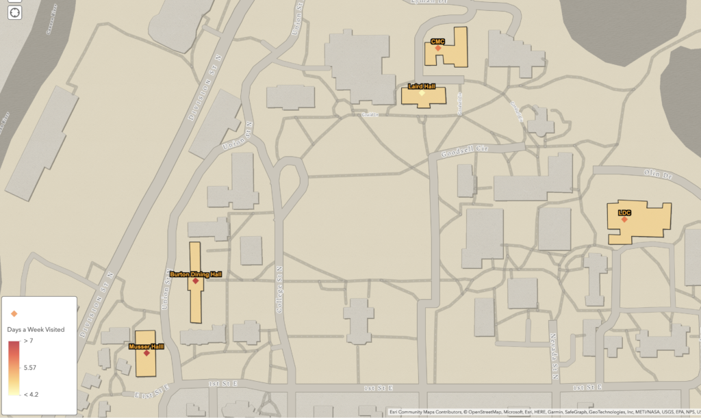

I really like the color scheme of this map. I think that the contrast between the background and the buildings you frequent on campus makes it very easy to digest. One thing I think would be helpful would be to make the diamonds bigger so that it is clear how many days a week you visit each building. I agree that being able to draw on top of historical maps is something very useful in the digital humanities realm. It can allow historians to highlight the differences between modern and historical maps. The polygon tool specifically can draw the user’s attention to certain locations.