When looking through the possible options for network projects I might investigate, there was one that I immediately could tell what the input data was and thus, would be easy to comprehend. That being Andrew Beveridge’s Network of Thrones.
Now I am not someone who is into Game of Thrones. It’s just not my kind of show. However, I do know a good bit about it from Pop Culture osmosis. GoT has a lot of characters and interconnected plotlines happening congruently, essentially covering 5-10 individual stories at a time which can be hard to understand or keep track of, let alone determine who the main character is.
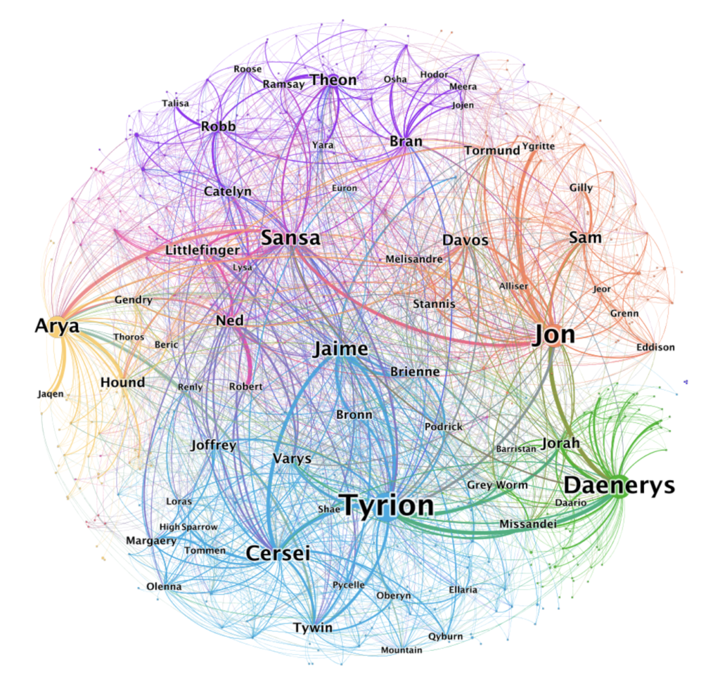
However, Beveridge’s charts do just that. Character in the show have relationships and interact, and the more a character interacts with others, the more characters they interact with, the more effect they have on the whole narrative. Now that the show is over, there’s a huge chart cataloguing every relationship that ever occurred in every episode of the eight seasons and charted on a big web. The bigger a person is, the more networks and thus focus they have on the big picture. Minor characters, those who barely interact with others, are the miniscule dots on the massive interconnected web.
The biggest downside to the chart is that it’s a lot to take in. One of the ways Beveridge fixes that is by having 8 different charts for each individual season of the show. These 8 charts are then combined to show the conglomorate featured above. Note: color is also of significance since it alligns to which faction the individuals are part of.
There’s not many ways to directly interact with the graphs but the sheer amount of reflective data and the fact said data is open source really helps with that downside.

I think it’s so cool that someone took the time to watch all 8 seasons of the show and write down all the interactions and categorize them to create this network. As someone who doesn’t watch GoT, I think it is pretty cool and provides a good background if I were to watch it. It would be cool if there were more ways to interact with the chart and learn more about the show that way.