I used Rawgraphs to visualize the data for this project.
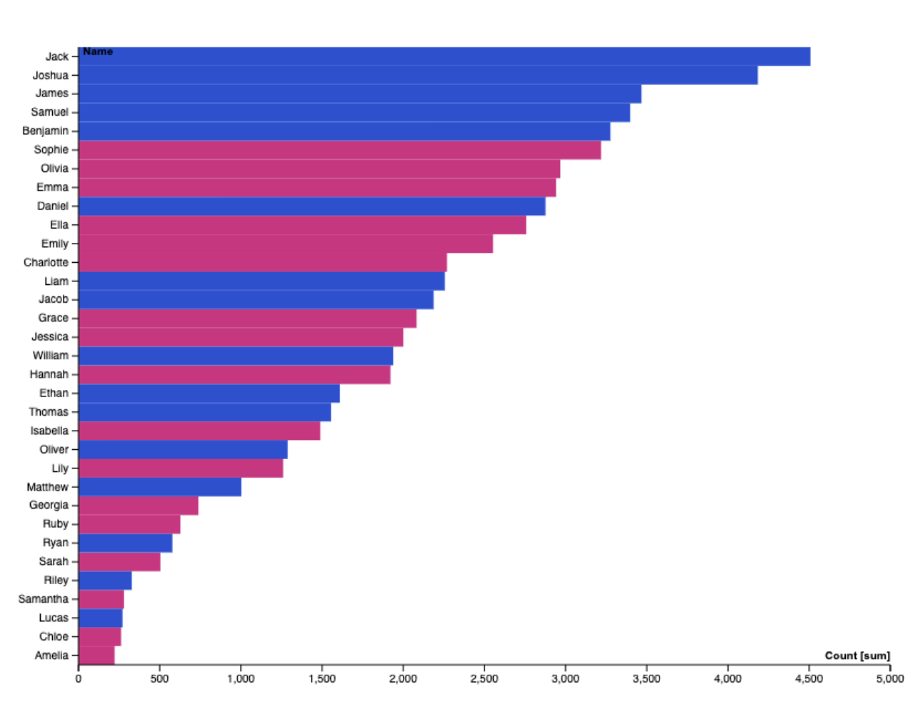
I wanted to target the names themselves in my analysis, rather than any change over time. Thus, I declined to use the “years” stat and instead compared the names to their total count in all of the years combined. One thing I noticed is that, over the ten year span, there were only 33 names that reached the 10 most popular at any time, showing that New-Zealanders had a lot of overlap in name-picking between years, and many popular names stayed that way for long periods of time. Boy names that start with J (Jack, Joshua, James, Jacob) in particular were very consistently popular for some reason. I also noticed that all of these names are very anglo-European, showing Europe’s influence in New Zealand.
I had to change a few things to enhance the clarity of the visualization. First, I changed the graph to sideways-oriented instead of vertical, because in the original vertical format the names overlapped due to space constraints and were illegible. I also had to change the margins because some of the longer names weren’t completely fitting on the page. Finally, I changed the color scheme to differentiate boy and girl names with the classic blue-pink classification. This color scheme, while easy to understand for viewers, reflects the twisted gender binary of today’s society that is discussed profusely in “What Gets Counted Counts”. Are there really “boy names” and “girl names”? This would imply that gender is not a spectrum, and that everyone will be put in one of two boxes based on their name until they change it themselves.
Before I used Rawgraphs to make my own chart, I attempted to use Java to see how the length of a name effects its popularity. By getting the spreadsheet data into a text file and using a loop to count the letters in each name, I was able to get the data I wanted:
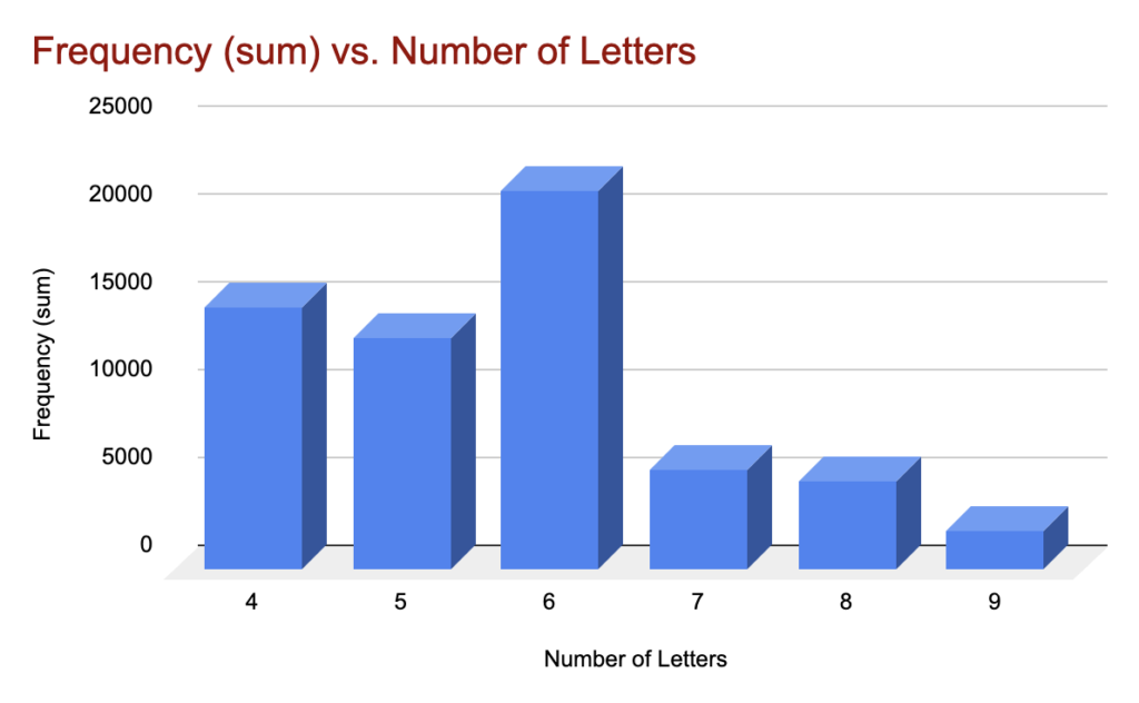
However, this data didn’t really have any correlation that seemed meaningful to me. I guess it was interesting that there weren’t any names with 3 of less letters (or 10 or more for that matter), but this was likely just a coincidence, and doesn’t reveal much about New Zealand naming practices. I was left with no choice but to try something else.

Interesting graphs!! I think making the first graph sideways definitely helps to make the graph clearer and easier to understand, particularly on a landscape-oriented computer screen where a vertically aligned graph might not be fully visible without scrolling. I wonder if adding vertical gridlines to the graph may make the number values of each name clearer, but, on the other hand, maybe the comparison of the names is more important than the actual numbers.