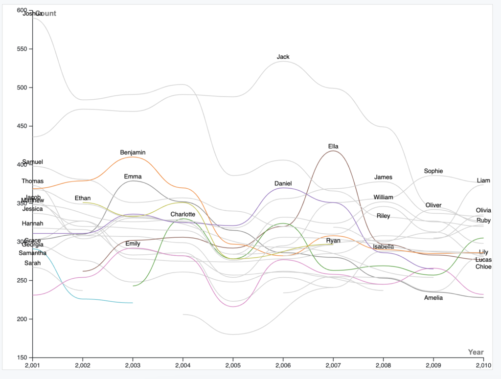
I chose to use a line graph because it shows the popularity of many names over time. Line graphs are ideal for showing that as opposed to a bar graph or histogram. During my work with “Rawgraphs”, I set the x-axis to year, and the y-axis to count average, but because no name was repeated twice in the same year, the average part didn’t matter. The other visual I changed besides that was the coloring for different names. This made it a lot easier to see individual name popularity, and it relates what Lin said about data presentation and making it both accurate and understandable.
Lin’s lecture emphasized that objective matters in displaying data. As humanities students, we need to be aware of what we are trying to show and what we actually convey. Visuals are everything in the digital humanities. Some graphs look so messy they lose their purpose. Other graphs may be displaying an unintentionally different one. The humanities use quantitative data as well sometimes, and when it’s necessary, a clear-cut, visually appealing visualization of data can go a long way. One thing that should also be considered in digital humanities projects is its compatibility with different types of devices. Having a display work on a computer is great, but having it readable on a mobile device is something digital humanists should strive for going forward.

I loved how you incorporated all the data point in one graph and it is quite easy to grasp. The only thing I would recommend is that the names kind of got cluttered a little bit but other than that looks great!