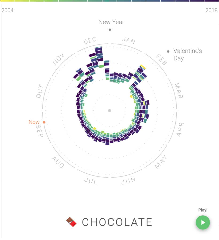
I chose the Rhythm of Food project, a data visualization project that shows Google search trends for different foods throughout the year from 2004-2018. The data for this project comes from Google Trends, and the process consisted of finding each food’s Google Trends score (0-100) for each week from 2004 through 2018. The presentation consists of mapping the scores on a circular graph, as shown above. The project and its data are open source and open access, as all of the data comes from Google Trends. The project was carried out by Google News Lab, a team at Google working to digitally provide credible information to the world, and Truth & Beauty, a data visualization service. I found this project super interesting, as it is fun to try to explain the trends for the different foods. For example, in the graph for chocolate, there are peaks in November, December, and February. These peaks correspond to Thanksgiving, Christmas, and Valentine’s Day, respectfully, which are holidays that people usually purchase chocolate for. While exploring the site, I began to wonder how trends for different foods can are used by brands and marketers to increase sales of their products during different seasons. For example, a lot of foods have seasonal flavors (pumpkin spiced lattes, peppermint Oreos), which is likely because people are more likely to purchase products with pumpkin in the fall and peppermint in the winter. Understanding how people’s interests change throughout the year would be useful for maximizing sales. I think after seeing this project I’ll be more aware of seasonal/limited time marketing and not falling victim to it. Overall, this project is really cool, and I highly recommend you check it out!
