A link to my map is here. A link to my spreadsheet is here.
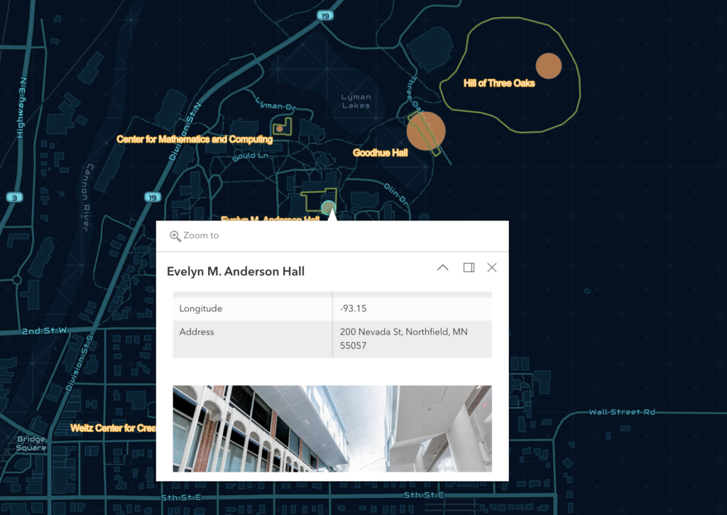
I thought making this map was a lot of fun. I had a hard time adding images to the popups; I had to add URLs into the CSV and download it a second time. I chose to have the size of the points change based on how often I visit each place to add some symbology. One roadblock was that arcGIS’s map doesn’t have the updated outline of the Anderson/Olin/Hulings complex, so I had to look it up and estimate it as best I could.
I think web mapping can make geospatial mapping more accessible by putting it on the internet. It also allows for the creation of fun, graphic, interactive maps that can increase interest in a particular topic. ArcGIS in particular has a ton of options for customizing your map into virtually anything. I thought it was weird how some of the things I did most frequently were hidden behind menus and submenus, but overall it was pretty navigable. Its very powerful for being on the web.

I like the style you chose for your map! Trying to embed the map in the blog didn’t work for me, so I think just posting a photo is the right call. I also ran into the problem with the wrong outlies for Anderson and Olin, so I just guessed on the outlines. I agree that the software was confusing at first, but I was also able to navigate it by the end.