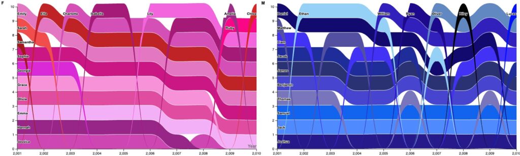
Through my graphs I wanted to represent the change in rank of each name over time. I originally had all of the names in 1 graph, however, I realized that the graph was very crowded and hard to follow. Therefore, I decided to split the graph into two, one for male and another for female names. The bump chart effectively outlines change over time. Each of the names is represented as a stream, moving down the y-axis as their name moves up in rank and visa-versa.
Through analyzing my graph I noticed that only 17 unique female names and 16 male names were in the 10 ten most popular names in New Zealand from 2000 to 2010. This highlights the consistency of popular names during this decade. I also noticed that Joshua and Jessica remained in the number 1 spot quite consistently across the decade.
In order to improve the clarity of the visualization, I changed the colors of the two series’ to reflect the traditional colors to represent females and males. I also added an outline to the names of each stream, in order to see them better. The graphs were originally quite narrow and small so I changed the dimensions of the graph to better show the flow of names over time.
I think that this particular dataset could be problematic as it splits names into two very binary categories. Catherine D’Ignazio and Lauren Klein’s “What Gets Counted Counts” analyzes the detrimental effects of binary categories in data representation. They conclude that it is important to recognize when creating a DH project that classification systems and counting is always complicated and must be handled with “issues of privacy and potential harms in mind”. Keeping this in mind, next time, I might choose to use a more diverse dataset that uses baby names in general rather than gendered baby names. I also might choose to use more neutral colors to represent the male and female names that do not reflect societal stereotypes.

I like how you divided the names by gender; that makes it easier to see. One problem I see with this graph is the y-axis. The lower (in number) a name is, the more popular it is. But looking at the graph, the less popular names are at the top, which could give viewers a misguided notion.
This is a really cool display of the data. The actual babynames data is HUGE, so I don’t think this would be an effective way to track the data when using a wider df, but for what we were given it works. Seeing as there are names that bleed into the graph instead of being labels on the y-axis, maybe a different graph like a line graph would display the data more clear. Or making the names apart of a legend and have the years remain on the x-axis and the y-axis display count of names.