I chose to visualize how the count for each name differs across the years. I decided to to visualize this with pie charts. Showing for each name the proportion of that year in regards to the total count. I tried out a lot of different ways to showcase the change in every name. Line charts, bar graphs and more but all of them seemed so overcrowded like it was laying everything on top of each other and made it really hard to read. Because it is a different pie chart for each name it doesn’t have this problem. Each name can be examined separately or if you zoom out you can examine all of the names together. I made quite a few changes from the default pie chart. First of all I got rid of the donut hole effect. I find it a lot harder to compare opposite sides of a pie chart if there is space between. I think the donut hole looks cool but I find it unhelpful. I also changed the colors opting for a specific color palate and not rainbow. I personally find it difficult to read pie charts when there just filled with a ton of different colors. When there is just a few segments I think many different colors works well but when you have 7 or more segments I do not think it looks very good. Finally I made the system display all years even if they slightly overlapped. It doesn’t look the greatest in names like Emily and Jack but I think the pro of actually being able to see what each slice represents outweighs that con. In regards to Lin’s lectures I think the two most important things I took was to not to start with looking for a specific correlation but read the data and see what’s telling you, try different things and see what actually seems interesting. The second important thing was to choose the right visualization.
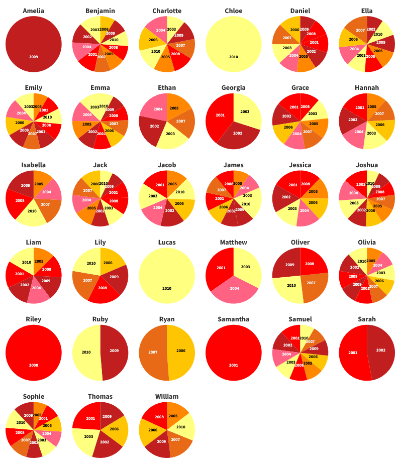

Woah. This looks really interesting and the colors are really nice but I feel like the method of comparison doesn’t make sense to me. Why put them each in a pie chart rather than have each be a bar graph? Also there isn’t a good way of comparing how many “values” a slice of the pie represents. Despite the nitpicks, I really enjoy the layout and coloration of this.
I find it very interesting that you used multiple pie charts to track the popularity of names over the years! In addition to your point on there being too many sections, I also think having a pie chart of just one section doesn’t say much. With some better data, I think your pie chart idea could really come into fruition.