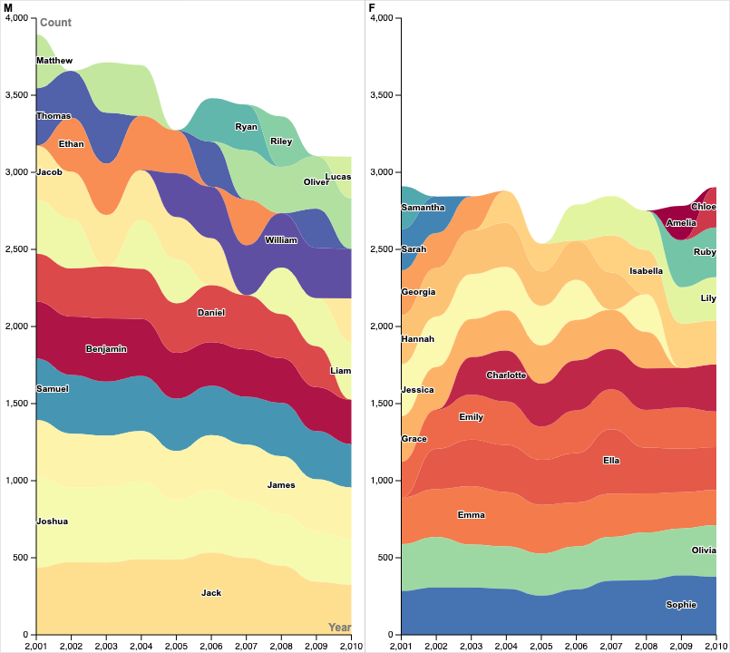
My graph displays the relative popularity of baby names between 2001- 2010 in New Zealand, using a stacked stream graph. Each name is assigned a different color, and uses vertical area to display the change in general popularity over each year in a sample size of 4,000. This style of chart isn’t good for general population, but it does show a general sense of the ratios between them, which is useful for knowing which is more popular than the others, rather then how popular each is.
To improve readability, I split the chart into two duplicates, one for male names, and another for female names. This highlights the different samples sizes of each gender – more male names were sampled than female names. It also prevents any issues in color contrast, by duplicating the set of usable colors.
I chose a stream graph rather than a typical graph to prevent overlap of the options. With so many names present, a line chart would become cluttered and unreadable- this style of graph separates them enough to piece out each individual, and as the data is based on a (relatively) small sample size, we aren’t worried about actual numbers, so being able to get an exact count for each name isn’t as important.
It’s easy to accidentally misrepresent data in the humanities, and even easier to lose what made the subject interesting in information’s conversion to data. As Liz Winton said in her presentation, good data tells a story in the way you’ve put it together. It should highlight what you consider to be the most important aspects, while not losing the big picture. With this chart, I hoped to make something sufficiently clear in which names are the most popular using that style of narrative- specifically in this case rank and change over time.

Compared to a conventional bar graph or scatter plot, the stacked stream graph made the information much more appealing and honestly a lot prettier to look at. I like that you mentioned the discrepancy between the amount of male name samples and female name samples. I was wondering: what does this say about the sample group picked? Could the collectors of this data have done a better job ensuring that there would be equal representation between the two groups in their sample? Because of this discrepancy, we can’t effectively compare the frequency of male names to female names because the sample sizes were different.
I can imagine it might be difficult to maintain readability while using a style as dense as the stream-style graph, but I think you did a good job! I think a couple of the colors might be a little too close to each other, especially when considering variety in human color perception, but you’ve certainly picked an appealing palette. I also like that you specifically talk about the story you want to tell with this graph: you’re not concerned with actual numerical data–you just want to quickly illustrate comparisons between names, and you’ve done a great job at that.