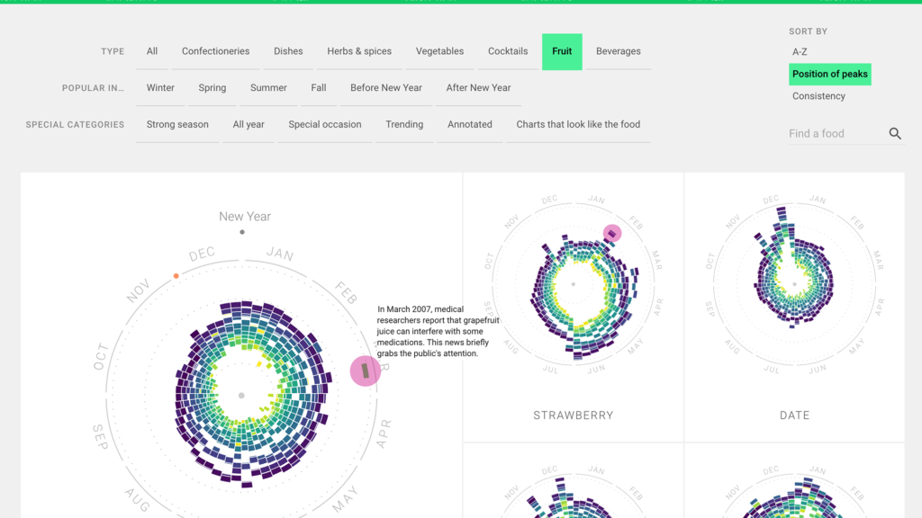
After looking through a couple of the DH projects, the Rhythm of Food stood out to me due to its captivating visualizations of graphs. The project aims to learn about food culture by analyzing Google search data. The primary purpose is to shed light on food seasonality and how foods have become more or less popular over time. Overall, there are more than 150,000 data points on over 200 different topics. The sources are the Google search queries. They looked at hundreds of ingredients, recipes, and other food-related search terms and connected them with different foods. They collected data for more than 12 years! Hence, there are many data points that they show. The main academic field this belongs in is digital humanities, so it makes a lot of sense that we are looking at it in this class.
After collecting the data, they first analyzed the data in a line chart because it clearly presented where there were spikes and dips in the graph. Then, they put the data in a radial “year clock” chart to make the data easier for viewers to visualize. Next, I think the coolest part of this project is the animation aspect. They added an animation from the line chart to the radial chart so viewers can understand how to read it because it may confuse some. So, the animation was not only visually appealing, but it helped with comprehension as well. This helped me a lot because, without the animation, it would have taken me a lot more time to understand the radial chart. Next, they researched the cause of specific peaks and dips in the data and explained them. For example, Mint Julep peaks only around the time of the Kentucky Derby, but it’s data points are very minimal for the rest of the year. This is because mint julep is the official drink at the Kentucky Derby and is the special occasion where it is drunk. The project was built using multiple different software including ES2015, webpack, react, Material UI, and d3 v4. I thought the visualizations were amazing so my main question is how to use the software to develop visualizations like the ones in this project.

That’s cool! I agree that the multiple ways to visualize the search trends of certain foods was a nice touch. 12 years is also a long time to be compiling this data. I wonder if this data could be expanded by counting words referring to the same food, but in different languages. That might eliminate a possible English-language bias in the search queries.
I completely agree, the Rhythm of Food project is truly captivating with its impressive visualizations. The way Google Search data was utilized to explore food culture and seasonality is remarkable, and the transition from line charts to the clock charts with the animations is not only visually appealing but also enhances comprehension. This project really is a fantastic example of how digital humanities can provide valuable insights through innovative data presentation.